Monday, August 4, 2014

SVG vs PNG Logo Results

Earlier today I wrote about the method I used to convert my website logo from a scalar PNG to a vector SVG file. I wanted to share the results with you.I opened the site up in Firefox, and then CTRL+ zoomed in as far as possible. Then I screenshot'd a before and after:

Scalar PNG Logo:


Scalar PNG Logo:


Another nice feature is a size reduction of the image file. I went from 604B to 294B, which is a better than 50% reduction! Granted, both files are incredible tiny, but I've tested with a more complex logo and the reduction is even better, down from 2340B to 704B.

Converting Logo to Scalable SVG

Background


When coming up with a logo, I took inspiration from the first letter of my name: A. I played around with many variations, and eventually came up with a symbol which resembles an A but isn't exactly the same.


I took my sketches out ideas, and went into Paint.net to come up with a sharp looking PNG icon. I started out large, at 500px by 500px, and then resized down to come up with an icon which looks decently sharp (I've played a gray background under it to make it easier to see):


I plugged it into my website (my WIP website which has been sitting on my localhost for 6 months now, awaiting the availability of andymercer.net), and left it there.

Recently I built a site for my partner at Catstache, and when I tested it on a high-res screen, her logo looked terrible. I realized the problem was that it was the only thing on the site that wasn't vector. I immediately remembered my own logo, and sure enough when I tested, it too looked blurry when zoomed in. I set out to rebuild it in a vector format.


Solution


I chose SVG as my format because it's the mist widely support vector format. Every web browser will correctly render an SVG image, and it'll look sharp at any size. The issue is that one has to either build the image with a vector program (which I don't have) or code it manually, which sounds complex. Given my lack of Photoshop, I looked into coding it by hand.

To my surprise, I found that it's actually incredibly simple. You basically imagine a grid, starting from the top-left, and moving down. You define shapes, and give them an X and Y coordinate (higher being further right and down). That's it. I broke my logo into two polygon shapes, and defined each breakpoint.

<svg version="1.1" baseProfile="full" width="50" height="50" >
    <polygon points="15 5, 11 20, 39 20, 35 5" fill="white"/>
    <polygon points="10 25, 5 45, 15 45, 16.5 39, 33.5 39, 35 45, 45 45, 40 25" fill="white"/>
</svg>


This ends up appearing as:


You should be able to see it, and if you zoom this page, it should stay super sharp. And only 4 lines of code. Success!

EDIT: I just viewed this post on my Galaxy S4, and the difference between the PNG and the SVG is enormous. The SVG is far sharper.

Saturday, August 2, 2014

Mindstate - New Song By Computer Magic

Computer Magic just released a new song, for free as usual. Have I ever mentioned that I love free music?


If you like it, go old school and buy a cassette or vinyl (I can say from experience that the vinyl looks great ... it's part of my collection of vinyl records that I'll be able to listen to someday when I get a record player).


----

Yes normally I don't recommend buying things, just like I said a long long time ago I'll never put ads on here. However, I'm not getting paid by Computer Magic, and I doubt she knows I exist; this is just a recommendation based on my own music likes.

Tuesday, July 29, 2014

First WP Bug Report

I reported my first bug with WordPress today. I created a new development site, dev.andymercer.net, to test out my plugins with WP 4.0. Admin Classic Borders works perfectly, but I found an odd occurrence with Featured Galleries. Using it seemed to break the post editing screen.

I tested and found that the problem is a change in the header above the editor for 4.0. When this new version of WP is released, the header will become sticky, and it'll follow as you scroll down the page. It works by using JS to detect when a user starts to scroll, and changing the header from normal positioning to fixed, which lets it follow you. When a user scrolls upwards, the fixed positioning is eventually removed.

The problem occurs when you are scrolled down enough to cause the fixed positioning to kick in, and then suddenly are at the top of the page, without scrolling up. The can occur when remove a metabox, such as featured image. This causes the page to shrink suddenly, but doesn't trigger the JS to fix the header. I'm glad, because it's a problem with the new header code, not with my gallery.


Hopefully I found it early enough to be fixed before 4.0 comes out. You can follow along, and read more about it, here:

https://core.trac.wordpress.org/ticket/29059

EDIT: Ticket was just assigned to the 4.0 milestone, meaning it has to be fixed before 4.0 can be released.

Friday, July 18, 2014

WordPress Media Selector - Mobile

WordPress 4.0 is coming along quite nicely, with Beta 2 being due soon. One area I'm very excited about is a makeover of the mobile version of the Media Selector. This is the popup that lets users insert media (pictures, video, etc) into posts. On the phone is currently looks very broken, so there's a big push right now to give it an overhaul. This is what you'd see on a phone right now, with WordPress 3.9:


As you can see, everything is squished because of how narrow the screen on a phone is. To address the problem, two major changes have been made. If the sidebar is removed, and the options a the top are changed from text links to a dropdown menu, everything gets a lot nicer. Throw in some CSS to make sure all the images are in a nice looking grid, and suddenly you have this:


Two changes can make a huge difference in the usability. I'm very excited about this change, along with everything else that is coming down the pipeline regarding media. WP just keeps getting better.

Daft Punk

Over the past year, Daft Punk has exploded in popularity. Random Access Memories and Get Lucky both won awards, and in fact for a while I couldn't go more than a few days without hearing them on the radio. While I do get a flash of hipster-like jealousy every once in a while, I am overall very very happy that they have finally achieved this level of recognition.

One small thing that I have a problem with though, is that everyone loves Get Lucky and ignores the rest of the album. There are some incredible songs, including a couple I think are even better than Lucky. Case in point, Beyond. The words are moving, but the end just hits you like a wave of pure eargasm. Take a listen.

Friday, July 11, 2014

WordPress Plugin Update

A while back, I wrote about an idea for a plugin that I was going to try and write. It would add a folder system to WordPress's media capabilities. As I later explained, this was somewhat beyond my abilities at that point. I have since, however, written two separate plugins, which are currently up on the WordPress repository.

Admin Classic Borders


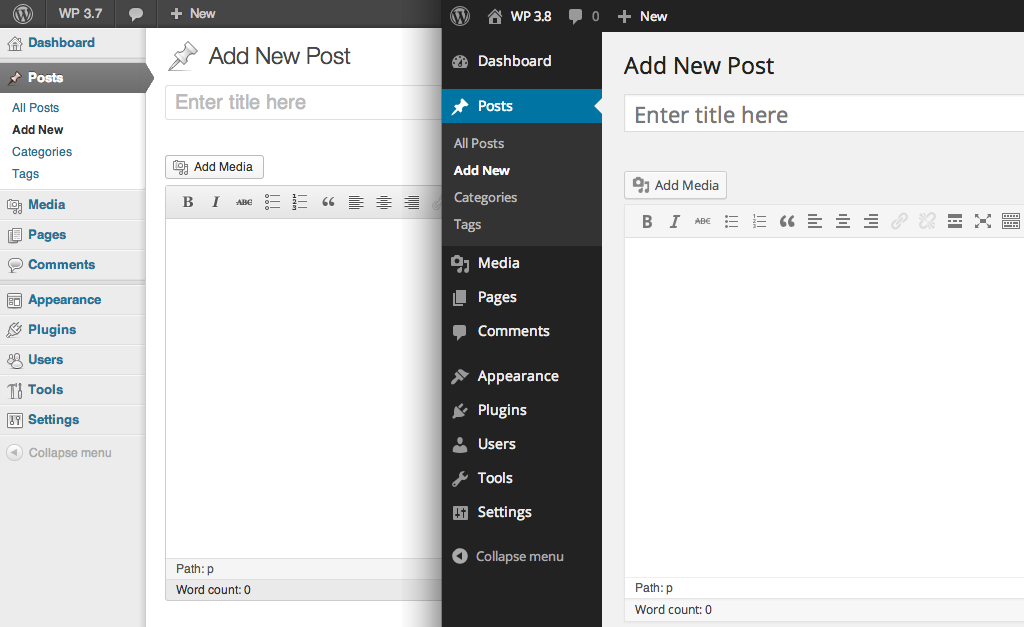
In WP 3.8, the admin backend of WordPress was completely redesigned. Taking queues from Windows 8, WP was made "cleaner", which means flatter and with less borders. Overall I think it looks good, but I like borders between items. I think borders make a site or app easier to use by cleanly dividing items.


To address what I perceive as shortcomings with the new design, I wrote some custom CSS to re-add borders, along with a few other things. Admin Classic Borders is simply a plugin wrapper for that CSS, along with a settings page to let users customize.


It's currently has a 5-star rating an almost 1000 downloads, which I think says quite a bit for my school of design thought. My second plugin, Featured Galleries, is a little more in-depth, so I'll discuss it in a separate post.