If anyone has happened to drop by my website, www.andymercer.net, recently, you'll find that a lot has been happening. The RMA website finally got moved to it's permanent location, then I got my own design up and online. To get it up quickly though, I did some lazy coding and used a template for almost every page. Over the past week, I've been fixing this, and last night I was ready to transition to the finished version.
I decided to use the opportunity to totally uninstall WordPress and reinstall in a sub folder, as part of a general housecleaning of my root hosting folder. Everything is now nicely organized into subfolders under public_html, with corresponding subdomains.
public_html/www = www.andymercer.net
public_html/development = dev.andymercer.net
public_html/smartsearch = smartsearch.andymercer.net
And so on and so forth. This will make maintenance easier in the future because everything that isn't part of the primary site is separated from the WordPress installation.
The final point of order is this blog, which I will expand upon in the next day or so.
Wednesday, February 25, 2015

Friday, January 23, 2015
Scalar Backgrounds in SVG
WordPress recently updated the built-in admin page that allows users to search for plugins hosted on the official plugin repository. One aspect of this update gave all plugins the ability to have icons. Icons are auto-generated patterns until the author uploads a real one, but obviously a hand-created icon is going to look better than a pattern of color. I set out to create an icon for my Featured Galleries plugin, trying to keep it similar themed to the cover photo.
Generally an icon indicating an image gallery is two images on top of one another, with the lower only barely visible. I decided to go with a minimalist approach similar to the front page of my website. A blurred out version of my blue background, with sharp white lines for the icon itself on top. I'd need a 256x256 PNG as well as a 128x128 PNG. Or, I could go with SVG. SVG is the obvious candidate, given that I'd only need one image, it'll scale perfectly, and I've been really into SVGs recently.
Problem is the background. The background image is not something that can be turned into a vector without losing what it is:

So I set out to check and see, can an SVG icon, or any element inside it, have a vector image background.
Turns out the answer is yes, and it's actually super simple. First you need to do is convert your vector image into a base64 datastream. Then you'll add a def element into your SVG, and inside of that add a style element so you can place some CSS.
Inside the URL, place the datastream code. The final SVG image becomes:

Thoughts:
As I've evolved as a designer, I've drifted towards full-screen image backgrounds as a natural evolution of full-width colors. I have never liked the look of a narrow column of text, so I'll do anything I can do to let me break that appearance up, mostly using full-width things. The problem with full-screen images is that they are resized. Sharpness is going to be an issue. On my own website (and business cards, and WordPress plugin cover photos), I've chosen to go with an image that I first overlayed with blue tint and then blurred out. The beauty of blurred out images for backgrounds is that sharpness no longer matters. I can made the images 800px by 600px, and just size it up and down as much as I want. It'll get more blurry, but so what? It ends up making life very very simple.
The same thing applies here. The background image in this SVG is going to be blurry. But it starts out blurry, so it doesn't matter. Using a vector background image inside an SVG wouldn't work if I wasn't already using a blurred out image.
Generally an icon indicating an image gallery is two images on top of one another, with the lower only barely visible. I decided to go with a minimalist approach similar to the front page of my website. A blurred out version of my blue background, with sharp white lines for the icon itself on top. I'd need a 256x256 PNG as well as a 128x128 PNG. Or, I could go with SVG. SVG is the obvious candidate, given that I'd only need one image, it'll scale perfectly, and I've been really into SVGs recently.
Problem is the background. The background image is not something that can be turned into a vector without losing what it is:
So I set out to check and see, can an SVG icon, or any element inside it, have a vector image background.
Turns out the answer is yes, and it's actually super simple. First you need to do is convert your vector image into a base64 datastream. Then you'll add a def element into your SVG, and inside of that add a style element so you can place some CSS.
svg {

  background-size:cover;

  background-repeat:no-repeat;

  background-image:url('');

}
Inside the URL, place the datastream code. The final SVG image becomes:
Thoughts:
As I've evolved as a designer, I've drifted towards full-screen image backgrounds as a natural evolution of full-width colors. I have never liked the look of a narrow column of text, so I'll do anything I can do to let me break that appearance up, mostly using full-width things. The problem with full-screen images is that they are resized. Sharpness is going to be an issue. On my own website (and business cards, and WordPress plugin cover photos), I've chosen to go with an image that I first overlayed with blue tint and then blurred out. The beauty of blurred out images for backgrounds is that sharpness no longer matters. I can made the images 800px by 600px, and just size it up and down as much as I want. It'll get more blurry, but so what? It ends up making life very very simple.
The same thing applies here. The background image in this SVG is going to be blurry. But it starts out blurry, so it doesn't matter. Using a vector background image inside an SVG wouldn't work if I wasn't already using a blurred out image.
Tuesday, January 13, 2015
Intelligent Friends are Great

Saw this in my Facebook feed today. It makes me happy that I have intelligent friends.
Sunday, January 11, 2015
Andy's CSS Best Practices

While a lot of languages have pretty well defined sets of best practices, CSS seems to fluctuate on a monthly basis. Is the cascade good or bad this week? Am I trying to be modular, or trying to have a few selectors as possible? Are classes good or bad? If you search in Google for "CSS Best Practices", you'll numerous articles explaining why "X Method" is the "RIGHT WAY". Problem is, that a lot of times these different methods contradict. The most sane article I've read on the topic in a long time was by Chris Coyier over on CSS-Tricks, entitled, "CSS: Just Try and Do A Good Job". He brought up a lot of these issues, and reached the conclusion that as long as you are trying to keep things logical and easy to read, then you're on the right track. Don't be lazy, do what makes sense, etc. Inspired by this, I'd like to share my set of CSS Best Practices ... the method to my madness, if you will.
Use One Stylesheet
As tempting as it is to split up stylesheets, I try to avoid this for performance issues. In this, as with everything, there are other opinions, but I prefer to avoid multiple files being downloaded.
Attach Styles to Elements (Not Classes or IDs)
This is the main point. With the rise of HTML5, we have a lot more elements to play with. I like to attach my styles directly to the elements, and then use classes as modifiers. I try to avoid using IDs at all (for styles). Example:
<article>

  <h2>Header</h2>

  <p>Content goes here.</p>

  <p class="highlighted">Content goes here.</p>

</article>
h2 {styles here...}
span {styles here...}
span.highlight {modified styles}My styles are attached to the h2 and span elements, while the class is used solely as a modifier. I never use classes by themselves, and I almost never use IDs. As with any rule, there are exceptions. The website logo, for example, I might identify with #logo, since it's unique on the entire site.
Nesting Is Okay
If I have a span inside an article that behaves in one way, plus a span in the footer which behaves differently, I'll use:
article span {styles here...}

footer span {styles here...}
Rather than give them classes. Many people say that we should try to avoid over specificity, and that nesting is entirely bad. I agree that we should try to minimize specificity, but we only have a limited number of elements to work with so there's going to be some. I do sometimes get around the element limit by "cheating though", which leads me to my next point:
Custom Elements (The "Bad" Way)
HTML5 gives us an official way to make custom elements. It's clunky because they have to have two words separated by a dash. Plus browser compatibility sucks. But here's the thing. As long as we are just talking container elements, I can name it anything I want to. I just have to make sure to define it with "display:block" in the CSS. I can have
<person>

  <h3>

    <display>John Smith</display>

    <edit></edit>

    <cancel></cancel>

  </h3>

  <span class="editable">

    <display>(555)-555-5555</display>

    edit></edit>

    cancel></cancel>

  </span>

  <span>

    display>johnsmith@email.com</display>

    edit></edit>

    <cancel></cancel>

  </span>

</person>
person {Styles here...}
person display {Styles here...}
person edit {Styles here...}
person cancel {Styles here...}Person, Display, Edit, and Cancel are all fake elements. But in this example (taken from a web app I'm currently building) they allow for code which is much easier on the eyes. Take a look at the same structure without custom elements.
<div>

  <h3>

    <div>John Smith</div>

    <button class="edit"></button>

    <button class="cancel"></button>

  </h3>

  <span class="editable">

    <div>(555)-555-5555</div>

    <button class="edit"></button>

    <button class="cancel"></button>

  </span>

  <span>

    div>johnsmith@email.com</div>

    button class="edit"></button>

    button class="cancel"></button>

  </span>

</div>
div.person {Styles here...}
div.person h3 div {Styles here...}
div.person span div {Styles here...}
div.person button.edit {Styles here...}
div.person button.cancel {Styles here...}The HTML is longer and we have to add another line of CSS, or add more classes.
Summary
As stated above, there is no one right answer here for how to structure your CSS. my method is to use custom elements, apply styles to elements, use classes as modifiers, and avoid IDs. What about you? Let me know in the comments what you think.
Thursday, January 8, 2015
Schedule Daily Automatic Emails in Outlook 2013
At work I have to send several emails out each day. One of these is exactly the same each day with the exception of the date. I added a reminded in Outlook's built in calender which reminds me every day at 4pm, but I wondered if I could make this even easier. Turns out that while there isn't a built-in way (which is pretty sad since this is version 15 or something of Outlook), you can get it working with a little Visual Basic help.
After searching online, I found a walkthrough on Super User which works. The gist of the method is:
- You set a daily reminder in the calender
- Use the reminder form as an email form
- Have visual basic create an email and insert the Subject, Body, Address from the reminder.
- Have visual basic send the email.
I like this method, but I ran into issues because the recipients go into the reminder's "Location" input box, and if you are sending to a lot of people, you run out of space. I realized though, that I could use part of the above method and integrate a template for a much better solution.
- Start a new email and fill in all needed information (subject, body, recipients). If you have a footer saved in Outlook, which Outlook inserts into new emails, delete this from the email.
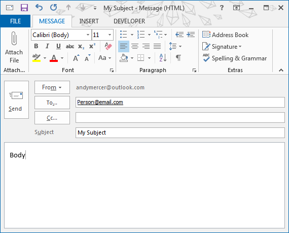
- Click on File -> Save As
- Give it whatever title you want, and then save it. Make sure though, that you save it as an Outlook Template (*.oft). For this example I called it "My Subject.oft"
- Open the Outlook calender
- Double clicking on a date.
- Click on Recurrence in the ribbon.
- Set the start time, set the duration to 0 minutes (End should be automatically changed to match Start), and then set the Recurrence pattern to Daily. I also set it to every weekday instead of every day, but you can do either.
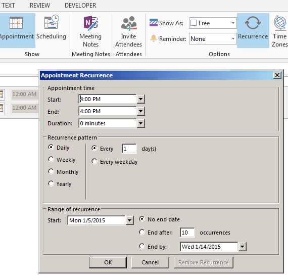
- Once you do, you should see it appearing in all days. You do need to do an extra step here of setting it to a category that your visual basic script can use to identify it. Any of the default categories will work, but I went ahead and created my own, using the same name was suggested in the Super User method: "Automated Email Sender".
I only have two changes from the method I found, and the method I'm using here. The first is that instead of having my visual basic script start with a blank email, I have it start with the template we just created. The second change is that I remove the code which pulls in the information for the email from the Reminder form, because we no longer need it. Line three is where we call the template. This assumes that the template is saved to the default location. You'll also need to make sure the title matches what you saved it as.
This will automatically send out an email created from the template that you saved, whenever the reminder goes off. You can set your reminder to be daily, weekly, or only once.
I want to put today's date in my email each time it goes out, specifically in the Subject line. Turns out there are no shortcodes you can use in the saved template. We have to add a new line to the Visual Basic script. Right before the line where we sent the email, we put in this:
What this does is says the Subject is now equal to the Subject plus today's date, in the format of "Weekday Month-Date-Year" (Ex: Thursday 1-8-15). If you note, the year has an extra wrapper function. This is because Year() is outputted as four digits, and I personally wanted only two.
These steps will get you a daily email set out automatically, based on your saved template, with the date automatically added each time. And you can send it to as many people as you could with a regular email because it's just a template; there's no using reminder input boxes for recipient input boxes.
After searching online, I found a walkthrough on Super User which works. The gist of the method is:
- You set a daily reminder in the calender
- Use the reminder form as an email form
- Have visual basic create an email and insert the Subject, Body, Address from the reminder.
- Have visual basic send the email.
I like this method, but I ran into issues because the recipients go into the reminder's "Location" input box, and if you are sending to a lot of people, you run out of space. I realized though, that I could use part of the above method and integrate a template for a much better solution.
Step 1: Create Template
- Start a new email and fill in all needed information (subject, body, recipients). If you have a footer saved in Outlook, which Outlook inserts into new emails, delete this from the email.
- Click on File -> Save As
- Give it whatever title you want, and then save it. Make sure though, that you save it as an Outlook Template (*.oft). For this example I called it "My Subject.oft"
Step 2: Create Reminder
- Open the Outlook calender
- Double clicking on a date.
- Click on Recurrence in the ribbon.
- Set the start time, set the duration to 0 minutes (End should be automatically changed to match Start), and then set the Recurrence pattern to Daily. I also set it to every weekday instead of every day, but you can do either.
- Once you do, you should see it appearing in all days. You do need to do an extra step here of setting it to a category that your visual basic script can use to identify it. Any of the default categories will work, but I went ahead and created my own, using the same name was suggested in the Super User method: "Automated Email Sender".
Step 3: Create Visual Basic Script
I only have two changes from the method I found, and the method I'm using here. The first is that instead of having my visual basic script start with a blank email, I have it start with the template we just created. The second change is that I remove the code which pulls in the information for the email from the Reminder form, because we no longer need it. Line three is where we call the template. This assumes that the template is saved to the default location. You'll also need to make sure the title matches what you saved it as.
Private Sub Application_Reminder(ByVal Item As Object)

  Dim objMsg As MailItem

  Set objMsg = Application.CreateItemFromTemplate("C:\Users\User\AppData\Roaming\Microsoft\Templates\My Subject.oft")

  If Item.MessageClass <> "IPM.Appointment" Then

    Exit Sub

  End If

  If Item.Categories <> "Automated Email Sender" Then

    Exit Sub

  End If

  objMsg.Send

  Set objMsg = Nothing

End Sub
This will automatically send out an email created from the template that you saved, whenever the reminder goes off. You can set your reminder to be daily, weekly, or only once.
Step 4: (Bonus) Autofill in the Date
I want to put today's date in my email each time it goes out, specifically in the Subject line. Turns out there are no shortcodes you can use in the saved template. We have to add a new line to the Visual Basic script. Right before the line where we sent the email, we put in this:
objMsg.Subject = objMsg.Subject & " - " & WeekdayName(Weekday(Date)) & " " & Month(Date) & "-" & Day(Date) & "-" & Right(Year(Date), 2)What this does is says the Subject is now equal to the Subject plus today's date, in the format of "Weekday Month-Date-Year" (Ex: Thursday 1-8-15). If you note, the year has an extra wrapper function. This is because Year() is outputted as four digits, and I personally wanted only two.
These steps will get you a daily email set out automatically, based on your saved template, with the date automatically added each time. And you can send it to as many people as you could with a regular email because it's just a template; there's no using reminder input boxes for recipient input boxes.
Monday, January 5, 2015
Are We Free to Discriminate?
I recently read an article and had some thoughts I'd like to share. The article is here:
Is it religious freedom or discrimination? - JCOnline
I've been avoiding this topic for a while now because I see both sides, but I feel the urge to step in. This will be a lengthy post.Would love to start a conversation, so feel free to comment.
A person (we'll call them Seller) opens a store, and offers a service. Should Seller be allowed to decide who they want to serve? Should they be allowed to serve only certain people?
This is the question before us, and despite some initial first thoughts, it's not simple or easy. It's complex. I can demonstrate this by giving you two examples which don't lead to the same easy conclusion:
------
Example A: Jill is a baker who bakes wedding cakes. Bob and Bill, two men, are getting married and want Jan to bake their cake. Jan is a Christian who is morally opposed to gay marriage, and refuses. Should she be allowed to refuse, or should the government force her to bake their cake?
Example B: The Millers are a black family in the deep south where racial prejudice is still frequent. They move to a small town where almost everyone is white, and try to get an apartment. They can't find an apartment because of their skin color; no one wants to rent to people who aren't white. Should the Government force the apartment managers to rent our an apartment to the the Millers?
------
A lot of people look at the Example A and are drawn to the side of the baker. Why should the government force someone to do work? Aren't we allowed freedom of commerce? Up until now the gay marriage debate has been pretty one sided in terms of who is trying to control others. (Christians wanted to control others by not allowing them to get married). But now it's flipping, right? Now it's the gay couple who wants to control the baker's actions. They seem to be losing the moral high ground.
But then we look at Example B and suddenly we feel a lot more sympathy with the party that is being denied the services. Partly it's the nature of the service (housing vs a cake) but mostly it's because of the nature of the discrimination. At this point in our society, the vast majority of us don't approve of discrimination against people because of their skin color because the vast majority of us don't think badly of people just because of said skin color. (Btw, The Millers couldn't have been denied an apartment in this Example, because it is illegal and has been for decades to discriminate on the basis of skin color when doing business due to the Civil Rights Act of 1964). We just haven't reached that level of societal acceptance with gay people yet, so it's a lot harder to identify with them.
Just for fun, let's consider something else. "No Shoes, No Shirt, No Service". That is discrimination that is allowed currently, and no one has a problem with it.
So here is where we stand. Should we allow individuals to choose exactly who and why they want to do any sort of business with? Or should we act as a society to prevent individuals from being assholes?
------
Despite all the seeming contradictions though, there is consistency. We just have to dig deep enough to find it. The most baseline rule is this:
> When a group of people reaches a level of full societal acceptance, then discrimination against them becomes morally wrong.
The word "full" is key. Despite what many people say, our society has a distinct libertarian bent, and we have an inherent distaste for adding yet another layer of control on people (On the baker). Even a minority, if large enough, and prevent this. This is what we are seeing now. The large minority of people who are still opposed to homosexuality are trying to prevent society from adding discrimination protections for sexual preference.
------
My one personal thoughts: As long as we have any discrimination protections at all, then I think we need to prevent discrimination on the basis of sexual preference. However, I'm not sure if we should we preventing discrimination at all. I see a benefit from it, but I also dislike the fact that government is dictating who someone can and can't do business with. At least I'm consistent though. I'd bet you that most people who are pushing for these "religious protection laws" wouldn't go on the record saying that a person should be allowed to discriminate on the basis of race.
Is it religious freedom or discrimination? - JCOnline
I've been avoiding this topic for a while now because I see both sides, but I feel the urge to step in. This will be a lengthy post.Would love to start a conversation, so feel free to comment.
A person (we'll call them Seller) opens a store, and offers a service. Should Seller be allowed to decide who they want to serve? Should they be allowed to serve only certain people?
This is the question before us, and despite some initial first thoughts, it's not simple or easy. It's complex. I can demonstrate this by giving you two examples which don't lead to the same easy conclusion:
------
Example A: Jill is a baker who bakes wedding cakes. Bob and Bill, two men, are getting married and want Jan to bake their cake. Jan is a Christian who is morally opposed to gay marriage, and refuses. Should she be allowed to refuse, or should the government force her to bake their cake?
Example B: The Millers are a black family in the deep south where racial prejudice is still frequent. They move to a small town where almost everyone is white, and try to get an apartment. They can't find an apartment because of their skin color; no one wants to rent to people who aren't white. Should the Government force the apartment managers to rent our an apartment to the the Millers?
------
A lot of people look at the Example A and are drawn to the side of the baker. Why should the government force someone to do work? Aren't we allowed freedom of commerce? Up until now the gay marriage debate has been pretty one sided in terms of who is trying to control others. (Christians wanted to control others by not allowing them to get married). But now it's flipping, right? Now it's the gay couple who wants to control the baker's actions. They seem to be losing the moral high ground.
But then we look at Example B and suddenly we feel a lot more sympathy with the party that is being denied the services. Partly it's the nature of the service (housing vs a cake) but mostly it's because of the nature of the discrimination. At this point in our society, the vast majority of us don't approve of discrimination against people because of their skin color because the vast majority of us don't think badly of people just because of said skin color. (Btw, The Millers couldn't have been denied an apartment in this Example, because it is illegal and has been for decades to discriminate on the basis of skin color when doing business due to the Civil Rights Act of 1964). We just haven't reached that level of societal acceptance with gay people yet, so it's a lot harder to identify with them.
Just for fun, let's consider something else. "No Shoes, No Shirt, No Service". That is discrimination that is allowed currently, and no one has a problem with it.
So here is where we stand. Should we allow individuals to choose exactly who and why they want to do any sort of business with? Or should we act as a society to prevent individuals from being assholes?
------
Despite all the seeming contradictions though, there is consistency. We just have to dig deep enough to find it. The most baseline rule is this:
> When a group of people reaches a level of full societal acceptance, then discrimination against them becomes morally wrong.
The word "full" is key. Despite what many people say, our society has a distinct libertarian bent, and we have an inherent distaste for adding yet another layer of control on people (On the baker). Even a minority, if large enough, and prevent this. This is what we are seeing now. The large minority of people who are still opposed to homosexuality are trying to prevent society from adding discrimination protections for sexual preference.
------
My one personal thoughts: As long as we have any discrimination protections at all, then I think we need to prevent discrimination on the basis of sexual preference. However, I'm not sure if we should we preventing discrimination at all. I see a benefit from it, but I also dislike the fact that government is dictating who someone can and can't do business with. At least I'm consistent though. I'd bet you that most people who are pushing for these "religious protection laws" wouldn't go on the record saying that a person should be allowed to discriminate on the basis of race.
Friday, October 24, 2014
HandBrake Video Conversion Software
I've been working in my spare time recently on finishing up my Excel smart search app, and today I got to the point where I wanted to show it off to some friends. The problem is that it turns out it's rather difficult to find free software that also doesn't have malware, when it comes to screen capturing and converting video formats.
For capturing the video in the first place, I ended up going with a program called HyperCam 2. It's not the best software in the world, and it's not open source. It is free, though, and it works for what I need for the moment. One small problem with it is that it outputs in fully uncompressed AVI video. For a 2 minute video at 720p, we have a file that is 250MB. I began looking around for conversion software.
When you google "avi to mp4", you get a massive list of really crappy software which either costs money, is loaded with malware, or both. The problem is that these sites have gotten very good at SEO, and even places like cnet's download.com doesn't really scan them well. On further research, though (involving actual forums), I found an program called Handbrake, and it's absolutely wonderful.
Handbrake is an open source project housed at Sourceforge.net. It's a very small download, and it installed in 15 seconds (including the time it took me to click Accept Terms). It has a pretty simple interface. You select the source file, select the location and name of the new file. You choose what format you want to convert it into, and then click Convert. It took about 20 seconds to convert my 2 minute video. And file size went from 250MB to 5MB. That's a rather incredible reduction. (Granted, I did select Optimize for Web, and the new video is just very slightly more blurry because of that. When I didn't optimize, the video ended up about 30MB). See the screenshot below to check out what it looks like.

As someone who has written several WordPress plugins that I let people use for free, I very much appreciate kind words from someone who benefits from them, and in turn I try to give positive feedback for freeware that I benefit from myself. Hence this post. HandBrake is lightweight and works like a charm, plus it's malware free. Give it a try next time you need to convert video.
For capturing the video in the first place, I ended up going with a program called HyperCam 2. It's not the best software in the world, and it's not open source. It is free, though, and it works for what I need for the moment. One small problem with it is that it outputs in fully uncompressed AVI video. For a 2 minute video at 720p, we have a file that is 250MB. I began looking around for conversion software.
When you google "avi to mp4", you get a massive list of really crappy software which either costs money, is loaded with malware, or both. The problem is that these sites have gotten very good at SEO, and even places like cnet's download.com doesn't really scan them well. On further research, though (involving actual forums), I found an program called Handbrake, and it's absolutely wonderful.
Handbrake is an open source project housed at Sourceforge.net. It's a very small download, and it installed in 15 seconds (including the time it took me to click Accept Terms). It has a pretty simple interface. You select the source file, select the location and name of the new file. You choose what format you want to convert it into, and then click Convert. It took about 20 seconds to convert my 2 minute video. And file size went from 250MB to 5MB. That's a rather incredible reduction. (Granted, I did select Optimize for Web, and the new video is just very slightly more blurry because of that. When I didn't optimize, the video ended up about 30MB). See the screenshot below to check out what it looks like.
As someone who has written several WordPress plugins that I let people use for free, I very much appreciate kind words from someone who benefits from them, and in turn I try to give positive feedback for freeware that I benefit from myself. Hence this post. HandBrake is lightweight and works like a charm, plus it's malware free. Give it a try next time you need to convert video.
Thursday, September 11, 2014
How Far We've Come in 13 Years
It's been 13 years since extremists attacked the USA. 13 years, and the world seems just as dangerous as it was before. The heady days of the Arab Revolution, when waves of democracy and popular rule were sweeping the middle east, are long gone. Egypt is back where is started, Syria never finished falling in the first place, and Libya is in the middle of a new civil war. Not to mention ISIS. Oh and Ebola is slowly decimating Africa, country by country.
But consider this. Osama Bin Laden is dead, along with nearly every senior Al Qaeda commander from the time. The new World Trade Center building is almost complete. Unemployment is getting close to falling under 6%, and the GDP is up. Plus technology marches on. Direct brain to electrical connection, internet so fast you could download the Library of Congress in minutes, fully electric cars which go hundreds of miles between charges, and even reusable rockets which can land vertically, all coming down the pipeline.
The world is in a race. A race between technology and entropy, and I speak of entropy metaphorically. Entropy is the forces of chaos, the forces of destruction. Extremist religion (of all flavors), global climate change, diseases such as Ebola, poverty, and even just the natural slow progression of all governments into totalitarianism.
And it isn't new. History and human civilization are cyclical. The forces of chaos knock everything down, and then we slowly rebuild. We get knocked down, and we rebuild. 1200BC, 500AD, both times civilization collapsed. But each time, we retained more technology than before. The only question that remains is how far we can get before the next collapse. I have high hopes. I look around and see how fast we are progressing, and I think we can beat it. I think that my generation can be the first to permanently colonize something that isn't on Earth. We we can spread out, we can finally break the cycle, and then how far do you think we'll go?
But consider this. Osama Bin Laden is dead, along with nearly every senior Al Qaeda commander from the time. The new World Trade Center building is almost complete. Unemployment is getting close to falling under 6%, and the GDP is up. Plus technology marches on. Direct brain to electrical connection, internet so fast you could download the Library of Congress in minutes, fully electric cars which go hundreds of miles between charges, and even reusable rockets which can land vertically, all coming down the pipeline.
The world is in a race. A race between technology and entropy, and I speak of entropy metaphorically. Entropy is the forces of chaos, the forces of destruction. Extremist religion (of all flavors), global climate change, diseases such as Ebola, poverty, and even just the natural slow progression of all governments into totalitarianism.
And it isn't new. History and human civilization are cyclical. The forces of chaos knock everything down, and then we slowly rebuild. We get knocked down, and we rebuild. 1200BC, 500AD, both times civilization collapsed. But each time, we retained more technology than before. The only question that remains is how far we can get before the next collapse. I have high hopes. I look around and see how fast we are progressing, and I think we can beat it. I think that my generation can be the first to permanently colonize something that isn't on Earth. We we can spread out, we can finally break the cycle, and then how far do you think we'll go?
Wednesday, September 10, 2014
Text in SVG: 3nd Attempt (Size Reduction)
Several days ago I wrote about finally solving the text in SVG problem. The key was to pick an open-source font, obtain the woff and svg font files, convert those files into base64 data streams, and plop the whole thing inside the actual SVG itself. And it works!
Problem is, I overlooked the file size. My original PNG logo file is 20KB. The new SVG is 400KB. That's 2000% increase in size! And completely unacceptable to me. I set out to find ways to decrease the size.
My first find was the tspan element. This is an element, similar to HTML's span, which can be embedded in a text element. Instead of having a new text element for every enlarged letter, I can just wrapper those letters in a tspan element and use CSS to apply the font. This helps in rendering time, but unfortunately doesn't significantly change the file size (409KB to 408KB).
I then tried removing whitespace. It screwed up the file and didn't really save space.
My final idea was to look at the cause of the large size. The current SVG had both an SVG and WOFF font file embedded. Looking at the font size, it turns out that the SVG font files were huge. 120ish KB each, for the two fonts I'm using. And an SVG font is readable if one opens it in a text editor. It's kind of odd to look at, but I found a pattern, and I found saw each letter and typical character. I simply removed all characters that I'm not using for the logo. Doing this for both fonts and reencoding in base64 netted me a huge size reduction. The SVG logo is now down from 408KB to 120KB. That is still far larger than 20KB, but it's a gain I can live with given the sharpness benefits of SVG.
This does mean that if the text ever changes in the logo, I'm going to have to go back to my original font files and add or subtract certain characters. But the text is a company name, meaning it won't change often. I've texted in Chrome and Firefox on Android, along with Chrome, IE11, and Firefox on Windows. Take a look at the 408KG and 120KB versions below:


Problem is, I overlooked the file size. My original PNG logo file is 20KB. The new SVG is 400KB. That's 2000% increase in size! And completely unacceptable to me. I set out to find ways to decrease the size.
My first find was the tspan element. This is an element, similar to HTML's span, which can be embedded in a text element. Instead of having a new text element for every enlarged letter, I can just wrapper those letters in a tspan element and use CSS to apply the font. This helps in rendering time, but unfortunately doesn't significantly change the file size (409KB to 408KB).
I then tried removing whitespace. It screwed up the file and didn't really save space.
My final idea was to look at the cause of the large size. The current SVG had both an SVG and WOFF font file embedded. Looking at the font size, it turns out that the SVG font files were huge. 120ish KB each, for the two fonts I'm using. And an SVG font is readable if one opens it in a text editor. It's kind of odd to look at, but I found a pattern, and I found saw each letter and typical character. I simply removed all characters that I'm not using for the logo. Doing this for both fonts and reencoding in base64 netted me a huge size reduction. The SVG logo is now down from 408KB to 120KB. That is still far larger than 20KB, but it's a gain I can live with given the sharpness benefits of SVG.
This does mean that if the text ever changes in the logo, I'm going to have to go back to my original font files and add or subtract certain characters. But the text is a company name, meaning it won't change often. I've texted in Chrome and Firefox on Android, along with Chrome, IE11, and Firefox on Windows. Take a look at the 408KG and 120KB versions below:
SVG 408KB:
SVG 120KB:
Monday, September 8, 2014
Text in SVG: 2nd Attempt
Last week I attempted to convert a complex logo involving text into SVG, and failed. This was due to the fact that the logo in question used Palatino Tinotype, which is a font that seems to be completely safe because it's installed on all Windows and OSX machines. However, this is actually not an open source font, and Android phones don't come with it. The logo ended up using the default serif font for Android, which messed up the spacing and looks quite terrible.
Additionally, Chrome on Android doesn't support the CSS selector "first-letter", which I had been using to increase font sizes. I have since been able to address both of these problems. I split the "text" elements so that all first letters of increased size were in their own wrapper, which I applied a class to. Increasing the font size using this class works on all browsers. The font issue was more complex. The owner of the logo declined to pay $165 to buy Palatino Linotype, so I had to find a free alternative. After searching for a while, I came across TeX Gyre Pagella. This is a free font, and it looks extremely similar to Palatino Linotype. And so without further ado, I present the final product along with original PNG for comparison:

EDIT:
It turns out at at the time I posted this, I was STILL missing something. When SVG files are embedded, they can't have any external dependencies. This includes referencing fonts. I therefore had to convert the fonts to a data URI stream. To be entirely honest I have no idea how it works, except in concept. It takes the entire file, converts it into a special text language, and I insert that text blog into the spot that I'd put the font address. I found a very nice tool, which let me upload the font files.
One issue I now see is that the SVG file is much larger. We are talking 400KB instead of 5 or 10. This somewhat destroys a large advantage of SVG in the first place, which is the smaller file format. However, it retains the perfect sharpness at all sizes, which is worth it. I've edited the file which is previewing above, so it should look great on all devices, finally. If it doesn't on whatever you are viewing it in, please let me know!
EDIT 2:
Turns out that IE9-11 screws up the SVG if it is resized. This is because IE requires an extra attribute on the SVG element, called "viewbox". Since my SVG width is 1220 and height is 200, I have to add this: viewbox="0 0 1220 200". More information here.
Additionally, Chrome on Android doesn't support the CSS selector "first-letter", which I had been using to increase font sizes. I have since been able to address both of these problems. I split the "text" elements so that all first letters of increased size were in their own wrapper, which I applied a class to. Increasing the font size using this class works on all browsers. The font issue was more complex. The owner of the logo declined to pay $165 to buy Palatino Linotype, so I had to find a free alternative. After searching for a while, I came across TeX Gyre Pagella. This is a free font, and it looks extremely similar to Palatino Linotype. And so without further ado, I present the final product along with original PNG for comparison:
SVG:
Original PNG:
EDIT:
It turns out at at the time I posted this, I was STILL missing something. When SVG files are embedded, they can't have any external dependencies. This includes referencing fonts. I therefore had to convert the fonts to a data URI stream. To be entirely honest I have no idea how it works, except in concept. It takes the entire file, converts it into a special text language, and I insert that text blog into the spot that I'd put the font address. I found a very nice tool, which let me upload the font files.
One issue I now see is that the SVG file is much larger. We are talking 400KB instead of 5 or 10. This somewhat destroys a large advantage of SVG in the first place, which is the smaller file format. However, it retains the perfect sharpness at all sizes, which is worth it. I've edited the file which is previewing above, so it should look great on all devices, finally. If it doesn't on whatever you are viewing it in, please let me know!
EDIT 2:
Turns out that IE9-11 screws up the SVG if it is resized. This is because IE requires an extra attribute on the SVG element, called "viewbox". Since my SVG width is 1220 and height is 200, I have to add this: viewbox="0 0 1220 200". More information here.
Sunday, August 31, 2014
Downside of SVG - Fonts
My third attempt at conversion to SVG is a logo with text. I spent about 4 hours doing it, because it's got 16 different SVG elements without counting the linear gradients (which are creating using elements instead of CSS it turns out). In the end, it looks really great, and the text resizes smoothly in a way that you normally requires javascript:


Here's the thing. If you are reading this post via a Windows or OSX -based PC, then the two should look almost identical. If you are using Firefox on Android the same will apply. However, Chrome, Dolphin, and the Android browser itself, will all render this incorrectly. See the comparison below. The top is Firefox for Android, the bottom is Chrome on Android:

The problem is that the font I'm using is Palatino Linotype, which ships default with Windows and OSX (and somehow Firefox for Android??). Chrome doesn't have it though, and so pulls in the default Chrome serif font. It's thicker and so looks too big.
All of which leads me to a fundamental problem of SVG, which is that it's not prerendered, and because of that it relies on the browser having all rendering resources. If you notice in the comparison, there's another problem. The first letter of each word isn't a large size in Chrome. This is because Chrome doesn't support the CSS rule "first-letter" for SVG text elements. As I take SVG into more complex situations, I'm becoming less sure it is really read for primetime. Which is sad, because when I compare the SVG and PNG versions of this logo on my phone, the clarity difference is striking. I just have to find workarounds to all the things that Chrome is screwing up.
In regards to the font-face, I just need to embed the font or have the SVG pull from a hosted source. If one is using a commercial font, however, one runs into issues. Palatino Linoype costs 150 bucks, so for this particular logo I'm out of luck (unless someone knows a free alternative that looks close enough that most people won't tell the difference??). It can be mitigated by using open-source fonts. As to the first-letter issue, the alternative is to split the text elements into more text elements and apply the large size via classes.
I've started a StackOverflow question about workarounds to the first-letter issue. Hopefully someone will have a clever idea.
SVG:
Original PNG:
Here's the thing. If you are reading this post via a Windows or OSX -based PC, then the two should look almost identical. If you are using Firefox on Android the same will apply. However, Chrome, Dolphin, and the Android browser itself, will all render this incorrectly. See the comparison below. The top is Firefox for Android, the bottom is Chrome on Android:
The problem is that the font I'm using is Palatino Linotype, which ships default with Windows and OSX (and somehow Firefox for Android??). Chrome doesn't have it though, and so pulls in the default Chrome serif font. It's thicker and so looks too big.
All of which leads me to a fundamental problem of SVG, which is that it's not prerendered, and because of that it relies on the browser having all rendering resources. If you notice in the comparison, there's another problem. The first letter of each word isn't a large size in Chrome. This is because Chrome doesn't support the CSS rule "first-letter" for SVG text elements. As I take SVG into more complex situations, I'm becoming less sure it is really read for primetime. Which is sad, because when I compare the SVG and PNG versions of this logo on my phone, the clarity difference is striking. I just have to find workarounds to all the things that Chrome is screwing up.
In regards to the font-face, I just need to embed the font or have the SVG pull from a hosted source. If one is using a commercial font, however, one runs into issues. Palatino Linoype costs 150 bucks, so for this particular logo I'm out of luck (unless someone knows a free alternative that looks close enough that most people won't tell the difference??). It can be mitigated by using open-source fonts. As to the first-letter issue, the alternative is to split the text elements into more text elements and apply the large size via classes.
EDIT:
I've started a StackOverflow question about workarounds to the first-letter issue. Hopefully someone will have a clever idea.
Monday, August 18, 2014
CodePen.io SVG Feature Request Update
Less than two weeks ago I submitted a feature request to CodePen.io, for the ability to embed a 'pen as an SVG image. Not only did they respond within a few days saying that they'd add it to their list, they actually got it working .... in less than two weeks. Take a look at the logo I converted to SVG a few days ago, emdedded below from CodePen. It looks and acts like a simple image. This is how I'd be calling it in a production site, as an image. It's really easy now to compare the difference between the two image types:


Now, if CodePen could add the ability to take snapshots and version history like JSFiddle does, I'd have everything I need in one service and wouldn't have to use both.
SVG:
PNG:
(Displayed at native resolution)Now, if CodePen could add the ability to take snapshots and version history like JSFiddle does, I'd have everything I need in one service and wouldn't have to use both.
Sunday, August 17, 2014
Shift In Focus
Over the years, this blog has been somewhat of a scattershot of topics. Initially, it had a very political/civil liberties focus, but that branched into more theoretical topics, such as ethics and philosophy. As I moved into web development, and WordPress, those became topics of greater frequency. And scattered throughout have been posts on music, humor, and even poetry I've written.
You may have noticed that I haven't posted much about politics for some time, and the reason is that politics has become increasingly depressing to me. We live in a society which increasingly embraces constant surveillance, in which we daren't videotape a police officer out of fear of retribution. A society in which we can be sent to prison for shooting a home intruder who invades without a warrant or even warning, just because they happen to have a badge and made a mistake on the address. There are some bright spots. Marriage equality has won. The falling tree may not have hit the ground, but gravity took over years ago and the conclusion is foregone. But in almost all areas, the world has become a scarier and more depressing place.
I also don't write about civil liberties as much, because I have grown increasingly disillusioned and fed up with all sides. It is absolutely wrong to judge someone for the color of their skin, or for the person they love. But that cuts both ways, and as someone who has been judged for being a white male by my supposed allies, my willingness to get involved has decreased over time. Yes, I understand that I have white privilege, and any automatic judgement I get for my skin is nothing compared to the judgement that a transgender person of color gets. But time and time again I see a level of automatic hate coming from the non-cisgendered community that almost approaches the level of hate (that I've fought against) from the fundamentalist religious faction.
Which brings me to my final point. What I HAVE been writing more about recently is code. The beauty of PHP, of HTML, of CSS ... is that they are languages of utter and complete honesty, and logic. If you write something, it's either correct or incorrect. There's no debate, there's no hatred. Certainly people might have differences of opinion on best practices, or what browser to use, but in general it's a much more pleasant area to spend my time in. Additionally, the communities are some of the least judgmental communities that exist. No one cares about who you are or what you look like. If you can write good code, or design great UX, or even just come up with good ideas ... that is all that matters. WordPress contributors are from all around the world, and almost no one brings their societal/cultural baggage with them. Code is king, and I like code.
You may have noticed that I haven't posted much about politics for some time, and the reason is that politics has become increasingly depressing to me. We live in a society which increasingly embraces constant surveillance, in which we daren't videotape a police officer out of fear of retribution. A society in which we can be sent to prison for shooting a home intruder who invades without a warrant or even warning, just because they happen to have a badge and made a mistake on the address. There are some bright spots. Marriage equality has won. The falling tree may not have hit the ground, but gravity took over years ago and the conclusion is foregone. But in almost all areas, the world has become a scarier and more depressing place.
I also don't write about civil liberties as much, because I have grown increasingly disillusioned and fed up with all sides. It is absolutely wrong to judge someone for the color of their skin, or for the person they love. But that cuts both ways, and as someone who has been judged for being a white male by my supposed allies, my willingness to get involved has decreased over time. Yes, I understand that I have white privilege, and any automatic judgement I get for my skin is nothing compared to the judgement that a transgender person of color gets. But time and time again I see a level of automatic hate coming from the non-cisgendered community that almost approaches the level of hate (that I've fought against) from the fundamentalist religious faction.
Which brings me to my final point. What I HAVE been writing more about recently is code. The beauty of PHP, of HTML, of CSS ... is that they are languages of utter and complete honesty, and logic. If you write something, it's either correct or incorrect. There's no debate, there's no hatred. Certainly people might have differences of opinion on best practices, or what browser to use, but in general it's a much more pleasant area to spend my time in. Additionally, the communities are some of the least judgmental communities that exist. No one cares about who you are or what you look like. If you can write good code, or design great UX, or even just come up with good ideas ... that is all that matters. WordPress contributors are from all around the world, and almost no one brings their societal/cultural baggage with them. Code is king, and I like code.
Saturday, August 16, 2014
SVG: A More Complex Logo
My logo is extreme simple. It has two shapes and is all straight lines. Because of this simplicity, I had no trouble converting it to SVG, and the entire file ended up being four lines of code. My next challenge, then, is to convert a more complex logo, one which involves more shapes, and shapes which involve curves. My partner at Catstache has a logo which fits the bill. It's complex, has many layers, and is more than one color. So can it be done well in SVG? Lets take a look at the logo in PNG first:

As you can see there is a pen (which also is two letters), plus an ink drop, and a curved line. And this is all on a double circle. We'll need 6six different shapes to create the entire thing. Lets get started!
We first need to create the SVG wrapper code. I'm going to give it dimensions of 250 by 250. These will scale when it's displayed, but it's large enough that we won't have to use partial numbers much:
Inside that code, we'll add all of our shapes. SVG does layering in order of code. The first element that you type will be on the bottom, and the last one will be on the top. So we'll start with a gray circle. To create this, I'm going to use, and put it in the center by saying that the center's y and x coordinates at both 125, and the radius is 125:
This gives us: (JSFiddle)

Next up is the white border. Since this isn't on the outside, we need another circle, slightly smaller. It needs a white border, and transparent fill.
Adding this gives us: (JSFiddle)

Now that we have the background done, we need to start on the shapes. I'm going to do the pen first. I'm going to create a line using, and it will have two segments, all straight. The way this is created is really odd. You basically use letters as commands, inside the "d" attribute. "M" with coordinates is where the line starts, then "L" with coordinates means it moves to those new coordinates. A line with 2 segments has 3 points. So we'll use an "M" and two "L"s.
Adding this gives us: (JSFiddle)

The bottom portion of the pen shape consists of 4 segments, which means five coordinates. We'll use another, this time with an "M" and four "L"s.
Adding this gives us: (JSFiddle)

Next up, we need the ink drop. When I researched the shape, I found out that it is possible to make an ink drop. It's extremely complex though, so we are going to simply slightly and use an ellipsis. At most resolutions, it will be a negligible difference anyway. I'm also going to rotate it, to get the long radius angled towards the pen tip. This shape is similar to the circle, in that we declare the coordinates of the center. The difference is that there is an x radius and a y radius. Also, we are rotating 15 degrees, which is another attribute.
Adding this gives us: (JSFiddle)

Finally, we need to create the curving trail that the pen has already left. This is the most complex part. SVG has several ways to do curves, and to be honest I don't really fully understand them all. But the easiest is a method in which you define 4 points to make a single arc. We still use the, and still use the "d" attribute. Instead of an "L" command, we use a "Q" to create the curve. For this specific shape, we'll need to combine several arcs. After playing around for about a half hour, I got a long that looks very similar to the goal.
Adding this gives us: (JSFiddle)

Success! The final code ends up being:
As you can see there is a pen (which also is two letters), plus an ink drop, and a curved line. And this is all on a double circle. We'll need 6six different shapes to create the entire thing. Lets get started!
We first need to create the SVG wrapper code. I'm going to give it dimensions of 250 by 250. These will scale when it's displayed, but it's large enough that we won't have to use partial numbers much:
<svg version="1.1" baseProfile="full" width="250" height="250" xmlns="http://www.w3.org/2000/svg"  xmlns:xlink= "http://www.w3.org/1999/xlink">

</svg>
Inside that code, we'll add all of our shapes. SVG does layering in order of code. The first element that you type will be on the bottom, and the last one will be on the top. So we'll start with a gray circle. To create this, I'm going to use
<circle cx="125" cy="125" r="125" fill="rgb(24,24,24)" />This gives us: (JSFiddle)
Next up is the white border. Since this isn't on the outside, we need another circle, slightly smaller. It needs a white border, and transparent fill.
<circle cx="125" cy="125" r="115" fill="transparent" stroke="white" stroke-width="4" />Adding this gives us: (JSFiddle)
Now that we have the background done, we need to start on the shapes. I'm going to do the pen first. I'm going to create a line using
<path d="M192 50 L170 111 L186 117" stroke-width="4" stroke="white" fill="transparent" />Adding this gives us: (JSFiddle)
The bottom portion of the pen shape consists of 4 segments, which means five coordinates. We'll use another
<path d="M183 125 L167 170 L163 161 L146 175 L166 117" stroke-width="4" stroke="white" fill="transparent" />Adding this gives us: (JSFiddle)
Next up, we need the ink drop. When I researched the shape, I found out that it is possible to make an ink drop. It's extremely complex though, so we are going to simply slightly and use an ellipsis. At most resolutions, it will be a negligible difference anyway. I'm also going to rotate it, to get the long radius angled towards the pen tip. This shape is similar to the circle, in that we declare the coordinates of the center. The difference is that there is an x radius and a y radius. Also, we are rotating 15 degrees, which is another attribute.
<ellipse transform="rotate(15)" cx="183" cy="150" rx="3" ry="5" fill="white" />Adding this gives us: (JSFiddle)
Finally, we need to create the curving trail that the pen has already left. This is the most complex part. SVG has several ways to do curves, and to be honest I don't really fully understand them all. But the easiest is a method in which you define 4 points to make a single arc. We still use the
<path d="M130,193 C81,208 132,153 71,170 Q32,181 49,158" stroke-width="2" stroke="white" fill="transparent" />Adding this gives us: (JSFiddle)
Success! The final code ends up being:
<svg version="1.1" baseProfile="full" width="250" height="250" xmlns="http://www.w3.org/2000/svg" xmlns:xlink= "http://www.w3.org/1999/xlink">

<circle cx="125" cy="125" r="125" fill="rgb(24,24,24)" />

<circle cx="125" cy="125" r="115" fill="transparent" stroke="white" stroke-width="4" />

<path d="M192 50 L170 111 L186 117" stroke-width="4" stroke="white" fill="transparent" />

<path d="M183 125 L167 170 L163 161 L146 175 L166 117" stroke-width="4" stroke="white" fill="transparent" />

<ellipse transform="rotate(15)" cx="183" cy="150" rx="3" ry="5" fill="white" />

<path d="M130,193 C81,208 132,153 71,170 Q32,181 49,158" stroke-width="2" stroke="white" fill="transparent" />

</svg>Wednesday, August 6, 2014
Creating SVG with CodePen.io
Over the past few days, I've been exploring the SVG image format, and I converted my own logo, with great results. I decided to try my hand at a more complex logo, and I decided that instead of typing, saving, and refreshing the browser, I'd use Codepen.io. I chose this testbed over my normal JSFiddle.net testbed due to it's live updating capability.
I'll go into detail another time about the new logo, but suffice to say I got it working. To test in a webpage, I really wanted to just take the codepen that I'd created and embed it. They have a nifty feature where you can write JS or CSS in one 'pen, and embed the whole 'pen into another. Turns out this wonderful recursion doesn't work with inline SVGs though. It would be a great feature to have, though, I think. Apparently the creators of CodePen agree (and are also VERY timely with feature request responses. The ability to embed inline SVG 'pens into another 'pen is now on the feature shortlist!

I'll go into detail another time about the new logo, but suffice to say I got it working. To test in a webpage, I really wanted to just take the codepen that I'd created and embed it. They have a nifty feature where you can write JS or CSS in one 'pen, and embed the whole 'pen into another. Turns out this wonderful recursion doesn't work with inline SVGs though. It would be a great feature to have, though, I think. Apparently the creators of CodePen agree (and are also VERY timely with feature request responses. The ability to embed inline SVG 'pens into another 'pen is now on the feature shortlist!
Monday, August 4, 2014
SVG vs PNG Logo Results
Earlier today I wrote about the method I used to convert my website logo from a scalar PNG to a vector SVG file. I wanted to share the results with you.I opened the site up in Firefox, and then CTRL+ zoomed in as far as possible. Then I screenshot'd a before and after:


Another nice feature is a size reduction of the image file. I went from 604B to 294B, which is a better than 50% reduction! Granted, both files are incredible tiny, but I've tested with a more complex logo and the reduction is even better, down from 2340B to 704B.
Scalar PNG Logo:
Scalar PNG Logo:
Another nice feature is a size reduction of the image file. I went from 604B to 294B, which is a better than 50% reduction! Granted, both files are incredible tiny, but I've tested with a more complex logo and the reduction is even better, down from 2340B to 704B.
Converting Logo to Scalable SVG
Background
When coming up with a logo, I took inspiration from the first letter of my name: A. I played around with many variations, and eventually came up with a symbol which resembles an A but isn't exactly the same.

I took my sketches out ideas, and went into Paint.net to come up with a sharp looking PNG icon. I started out large, at 500px by 500px, and then resized down to come up with an icon which looks decently sharp (I've played a gray background under it to make it easier to see):

I plugged it into my website (my WIP website which has been sitting on my localhost for 6 months now, awaiting the availability of andymercer.net), and left it there.
Recently I built a site for my partner at Catstache, and when I tested it on a high-res screen, her logo looked terrible. I realized the problem was that it was the only thing on the site that wasn't vector. I immediately remembered my own logo, and sure enough when I tested, it too looked blurry when zoomed in. I set out to rebuild it in a vector format.
Solution
I chose SVG as my format because it's the mist widely support vector format. Every web browser will correctly render an SVG image, and it'll look sharp at any size. The issue is that one has to either build the image with a vector program (which I don't have) or code it manually, which sounds complex. Given my lack of Photoshop, I looked into coding it by hand.
To my surprise, I found that it's actually incredibly simple. You basically imagine a grid, starting from the top-left, and moving down. You define shapes, and give them an X and Y coordinate (higher being further right and down). That's it. I broke my logo into two polygon shapes, and defined each breakpoint.
<svg version="1.1" baseProfile="full" width="50" height="50" >

    <polygon points="15 5, 11 20, 39 20, 35 5" fill="white"/>

    <polygon points="10 25, 5 45, 15 45, 16.5 39, 33.5 39, 35 45, 45 45, 40 25" fill="white"/>

</svg>
This ends up appearing as:
You should be able to see it, and if you zoom this page, it should stay super sharp. And only 4 lines of code. Success!
EDIT: I just viewed this post on my Galaxy S4, and the difference between the PNG and the SVG is enormous. The SVG is far sharper.
Saturday, August 2, 2014
Mindstate - New Song By Computer Magic
Computer Magic just released a new song, for free as usual. Have I ever mentioned that I love free music?
If you like it, go old school and buy a cassette or vinyl (I can say from experience that the vinyl looks great ... it's part of my collection of vinyl records that I'll be able to listen to someday when I get a record player).
----
Yes normally I don't recommend buying things, just like I said a long long time ago I'll never put ads on here. However, I'm not getting paid by Computer Magic, and I doubt she knows I exist; this is just a recommendation based on my own music likes.
If you like it, go old school and buy a cassette or vinyl (I can say from experience that the vinyl looks great ... it's part of my collection of vinyl records that I'll be able to listen to someday when I get a record player).
----
Yes normally I don't recommend buying things, just like I said a long long time ago I'll never put ads on here. However, I'm not getting paid by Computer Magic, and I doubt she knows I exist; this is just a recommendation based on my own music likes.
Tuesday, July 29, 2014
First WP Bug Report
I reported my first bug with WordPress today. I created a new development site, dev.andymercer.net, to test out my plugins with WP 4.0. Admin Classic Borders works perfectly, but I found an odd occurrence with Featured Galleries. Using it seemed to break the post editing screen.
I tested and found that the problem is a change in the header above the editor for 4.0. When this new version of WP is released, the header will become sticky, and it'll follow as you scroll down the page. It works by using JS to detect when a user starts to scroll, and changing the header from normal positioning to fixed, which lets it follow you. When a user scrolls upwards, the fixed positioning is eventually removed.
The problem occurs when you are scrolled down enough to cause the fixed positioning to kick in, and then suddenly are at the top of the page, without scrolling up. The can occur when remove a metabox, such as featured image. This causes the page to shrink suddenly, but doesn't trigger the JS to fix the header. I'm glad, because it's a problem with the new header code, not with my gallery.

Hopefully I found it early enough to be fixed before 4.0 comes out. You can follow along, and read more about it, here:
https://core.trac.wordpress.org/ticket/29059
EDIT: Ticket was just assigned to the 4.0 milestone, meaning it has to be fixed before 4.0 can be released.
I tested and found that the problem is a change in the header above the editor for 4.0. When this new version of WP is released, the header will become sticky, and it'll follow as you scroll down the page. It works by using JS to detect when a user starts to scroll, and changing the header from normal positioning to fixed, which lets it follow you. When a user scrolls upwards, the fixed positioning is eventually removed.
The problem occurs when you are scrolled down enough to cause the fixed positioning to kick in, and then suddenly are at the top of the page, without scrolling up. The can occur when remove a metabox, such as featured image. This causes the page to shrink suddenly, but doesn't trigger the JS to fix the header. I'm glad, because it's a problem with the new header code, not with my gallery.
Hopefully I found it early enough to be fixed before 4.0 comes out. You can follow along, and read more about it, here:
https://core.trac.wordpress.org/ticket/29059
EDIT: Ticket was just assigned to the 4.0 milestone, meaning it has to be fixed before 4.0 can be released.
Friday, July 18, 2014
WordPress Media Selector - Mobile
WordPress 4.0 is coming along quite nicely, with Beta 2 being due soon. One area I'm very excited about is a makeover of the mobile version of the Media Selector. This is the popup that lets users insert media (pictures, video, etc) into posts. On the phone is currently looks very broken, so there's a big push right now to give it an overhaul. This is what you'd see on a phone right now, with WordPress 3.9:

As you can see, everything is squished because of how narrow the screen on a phone is. To address the problem, two major changes have been made. If the sidebar is removed, and the options a the top are changed from text links to a dropdown menu, everything gets a lot nicer. Throw in some CSS to make sure all the images are in a nice looking grid, and suddenly you have this:

Two changes can make a huge difference in the usability. I'm very excited about this change, along with everything else that is coming down the pipeline regarding media. WP just keeps getting better.
As you can see, everything is squished because of how narrow the screen on a phone is. To address the problem, two major changes have been made. If the sidebar is removed, and the options a the top are changed from text links to a dropdown menu, everything gets a lot nicer. Throw in some CSS to make sure all the images are in a nice looking grid, and suddenly you have this:
Two changes can make a huge difference in the usability. I'm very excited about this change, along with everything else that is coming down the pipeline regarding media. WP just keeps getting better.
Subscribe to:
Posts (Atom)
